Colorblind-friendly Solutions For Creating Visual Content

According to National Eye Institute, in average, every twelfth person in the world has one of types of color blindness. So, there are, at least, 300 million people who live with this deviation. 

When you should convey some information, using, for example, colored charts, it can become a problem. Visual content simplifies the perception of information, but, in this case, you may not do colorblind people a favor. 

In our article, we selected five other article, that can tell you about the key moments you should consider when creating visual content for people with color blindness.

What Is Color Blindness

According to Wikipedia, color blindness or color vision deficiency is congential or acquired decreased ability to see some colors or differences in color. People with color blindness have difficulties to recognize the color on traffic lights, puzzles, color-oriented games etc. 
There are two types of color blindness: 

  • Partial — when human eye can’t see certain colors. There are most popular types of partial color blindness: protanopia (warped perception of red shades), deuteranopia (human eye can’t see green shades), and tritanopia (warper perception of blue and violet shades). According to Ali Levine, the author of True Colors: Optimizing Charts for Readers with Color Vision Deficiencies article, if a person can’t see, for example, red color, it influences other colors too.

“A common misconception among those who are not colorblind is that if someone has red/green color blindness, they only have trouble with the colors red and green. However, these deficiencies can easily affect other colors as well; for instance, maroon and brown can look identical to people with red/green color deficiencies… after all, maroon is just brown with a touch of red. In other words, it is not just the colors red and green themselves, but also those colors within other colors,” wrote Levine. 

  • Full — when human eye can’t see colors at all and perceives the world around monochrome. Basically, a person with deviation like this sees the world as a black-white movie. 

How You Can Visualize Data For Colorblind People

Here, you can read five interesting articles about the most effective solutions for colorblind-friendly visual content:

The Best Charts For Colorblind Viewers

This is the article by Ivan Kilin, Visual Data Specialist, that contains detailed information about, how colorblind people see and what color palettes are the most suitable for them. Also, the material  has a lot of examples of colorblind-friendly charts and palettes.
The source: https://www.datylon.com/blog/data-visualization-for-colorblind-readers

True Colors: Optimizing Charts for Readers with Color Vision Deficiencies

Clear and interesting aforementioned article by Ali Levine. The author writes about color blindness and describes effective ways to create data visualizations for colorblind people. Also, Levine mentions special apps and simulators that recreate the vision of people with color blindness. Coblis is the one of examples of these simulators, and you can find the link to the program in the article itself.
The source: https://itstraining.wichita.edu/optimize_for_vision_deficiencies/

How to Use Color Blind Friendly Palettes to Make Your Charts Accessible

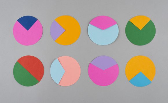
The article by Rachel Gravit describes the ways to make your visual content more inclusive. You can thus make your pie chart more understandable for colorblind people using bright contrasting colors, monochromatic color palette or different ornaments to highlight segments of pie chart. 

The source: https://venngage.com/blog/color-blind-friendly-palette/#5

Why Your Data Visualizations Should Be Colorblind-friendly

The article by developer Leoni Monigatti tells about the matter of color and the way every person sees colors, depending on type of color blindness. This article in not about pie charts only, there’s some useful information about any other types of data visualization. 

The source: https://towardsdatascience.com/is-your-color-palette-stopping-you-from-reaching-your-goals-bf3b32d2ac49

Contrast and Color

It’s the article by Maureen A. Duffy from Vision Aware, an online media for those who have vision deviations. The author briefly describes the principles of making right color decisions in design. Duffy recommends paying attention to bright and contrasting colors, because they are suitable for people with color blindness. Colors like blue, yellow, violet, and green are hard to see for colorblind people. 

The source: https://visionaware.org/everyday-living/home-modification/contrast-and-color/ 


We hope this article was useful for you. The approaches to creating colorblind-friendly visuals will make your visual data more inclusive and understandable for customers and colleagues that can’t see and distinguish some colors. 

Latest Articles

August 24, 2026
Scaling Machinery Sales with Product Twins: Solutions for Digital 3D Presentations

B2B machinery buying has changed, driven by a new generation of digital-first stakeholders (Millennials and Gen Z now represent 71% of B2B buyers). They reach out with expectations already formed, alternatives compared, and, in most cases, a preferred supplier identified. For manufacturers of large, complex equipment, that leaves a narrow window to influence the decision, and static PDFs, renders and videos rarely fill it. The fix starts with something most manufacturers already have. If you hold a 3D model of your equipment, it can become an interactive presentation asset: shown at full scale in VR, explored in a browser, or configured live on a tablet in a meeting. Up to 85% lower cost per event Our new whitepaper compares traditional sales methods (trade shows, physical demos, and international product presentations) with a VR-based approach and puts concrete numbers on the difference: Trade show presence: ~€340K → €30–50K per event. A year of international demos: ~€200K → €40K. Three scenarios, one model The whitepaper also breaks down three places an immersive 3D model does the work, each with its own logic: Sales presentations: Guide a prospect through a full-scale, interactive machine. Trade fairs: Show the whole catalog from a 50 m² booth instead of shipping one or two machines to a 200 m² stand. Inbound lead generation: Let buyers explore the machine in the browser before they fill out a form. It also includes real deployments from construction, mining, elevator, and heat transfer manufacturers, plus the buyer-behavior data behind the shift to digital-first sales. If you sell equipment that is expensive to ship, hard to demo, or still on the roadmap, this is the case for turning your CAD data into a sales asset. Read the full whitepaper

Industrial Trade Shows: 3D Visualization Is Changing the Game
August 20, 2026
Industrial Trade Shows: 3D Visualization Is Changing the Game

Next-generation Extended Reality tech is raising the standard for industrial 3D visualization. Complex equipment becomes much easier to show customers and walk them through, without hauling a physical unit to every meeting. For industrial machinery manufacturers, that’s real business value: by reducing their dependency on physical equipment, companies can improve sales demonstrations and make customer education more visual, scalable, and effective. The value is clear at trade fairs. Industrial machinery manufacturers can usually show only one machine in one configuration. On top of that, the most important parts are often hidden inside, and the product is displayed without the environment it was designed for. So the exhibitor arrives at the show unable to demonstrate the product they’re selling. This is where a new generation of Virtual Showrooms comes in. We’ll look at how it solves that problem below. The problems manufacturers face at trade shows But first, let’s look at the main challenges manufacturers face when relying on traditional trade show methods. The product does not fit. What a manufacturer sells is often far too big for any booth. A single production line can fill half a plant, and one machine can weigh five tons. But the trade show offers thirty square meters of rented floor at a high price. Exhibit space is the single largest line in the entire exhibiting budget: for U.S. B2B shows it accounts for 40.5% of an exhibitor’s total spend, more than any other category. At Hannover Messe (Germany), a modest 18 to 36 square meter stand costs €18,000 to €45,000, and a large one, 72 to 200 square meters, can pass €250,000. The equipment was never built to be lifted onto a stand, so a company pays the highest price in its budget for the one thing that still cannot hold the product it came to sell. Shipping machinery is expensive. The heavier the machinery, the higher the sales costs. Transportation, on-site assembling, and travel expenses can run into six figures per event. On average, construction, logistics and assembly add up to around €100,000 to get a single product onto the floor, and the largest, most impressive machines, the ones a company most wants buyers to see, are precisely the ones that push that figure highest. Buyers see a sample, not the range. Manufacturers have to choose which models to bring, and buyers never see the full portfolio. They are also limited by demo capabilities: system flow, scale, and engineering remain hidden. The value is hidden under the housing. Much of what a manufacturer charges for happens inside the machine, out of sight. Visitors stand in front of a closed housing and see only the outside of a product whose real engineering is sealed away. There is no context. Buyers need to understand how it fits into their own production line, works with existing equipment, and supports their process. That context cannot be brought to the booth, so much of the product’s value has to be imagined. The product may not exist yet. Sometimes the product a company needs to sell is still on the roadmap, or only half-built in a workshop. Industrial sales cycles are long, and buyers often need to commit before a machine physically exists. You are competing for the same buyer as everyone else. A trade show gathers the entire industry into one hall, which means every rival is only a few steps away. At IMTS 2024, visitors had to work through 1,737 exhibitors spread across more than 1.2 million square feet. Hannover Messe 2025 was larger, with 3,694 exhibitors from 62 countries and more than 123,000 visitors. In a room like that, you have to stand out to get noticed. How 3D solves each problem So, how can 3D visualization help? Problem: The product is too large to ship, or it does not exist yet. With XR, prospects can walk around a full-scale model of a product, explore different options for an engineered-to-order build, and see exactly what they are buying months before the first unit is produced. This can shorten the sales cycle. The format changes, but the product remains in front of the customer. Problem: Shipping and floor space eat the largest share of the budget. Extended Reality replaces the heaviest line items in the industrial sales budget with a single portable asset. Each of the costs for equipment transport, exhibition stand rental, assembly crew, technical team travel recurs with every event. Over a year, they compound into one of the largest budget lines in industrial sales. A 3D model is created once and can be presented on a screen, in AR, or in VR using equipment that occupies only a small part of the stand. It can be updated when the product line changes and redeployed without additional logistics. Problem: A physical demo can show only one configuration. Let each visitor build their own version. For configurable machines built to order, each customer can preview their exact configuration in detail rather than a generic prototype. A configurator on a touchscreen, or the same system in AR or VR, lets them choose components and options, see the result update instantly, and leave with a build that matches their plant. One asset covers all two hundred configurations in the catalog. Problem: The most important parts of the product are hidden inside. Exploded views, cutaways and animations show what happens beneath the surface. On a screen, a visitor grasps how the system works within seconds; in AR or VR, they can pull it apart and study the internals in detail.  Problem: Buyers can’t easily picture how the product fits their own plant. VR can put a buyer inside a virtual production line. AR can drop the equipment at full scale into the room right in front of them, so they can walk around it. This way, they can see how it fits their facility instead of guessing. Problem: You have a few minutes to catch attention, and competitors are right next to you. Big screens with motion are…

The State of 3D Medical Image Visualization in 2026
June 29, 2026
The State of 3D Medical Image Visualization in 2026

Today’s imaging systems are more powerful than ever. A single CT scan generates hundreds of cross-sections. An MRI cardiac study captures the heart in four dimensions. A full-body PET produces a dense volumetric map of metabolic activity across every organ system. And yet, in most hospitals today, clinicians consume all of that data the same way they did in the 1990s: as 2D slices, scrolled one frame at a time, with the third dimension reconstructed entirely in the radiologist’s head. That gap between the data that exists and the data that gets used is what 3D medical visualization is closing. Progress hasn’t been uniform. The specialties with the highest spatial stakes have moved fastest. In oncology, where tumour margins and vascular relationships determine whether a resection is safe, 3D visualization is now routine. In cardiology, where structural defects live in three dimensions that 2D echo can only approximate, volumetric review has become standard practice for complex case planning. For these teams, rotating a segmented model or flying through a volume-rendered vessel is part of the reading workflow. Within healthcare, oncology drives roughly 34% of total 3D imaging spend: 52% of cancer centers already use 3D imaging as part of their standard workflow, and 44% of cardiology departments do the same. For much of medicine, the shift is still underway. But the direction is clear. The market reflects it. The global 3D medical imaging market was valued at $21.43B in 2025 and $23.39B in 2026 and is projected to reach $42.75B by 2032  at a compound annual growth rate of 10.36%. Healthcare has become the largest adopter of 3D imaging technology overall. In this article, we break down what 3D medical visualization actually means technically and where it creates measurable clinical value. The imaging data problem Begin with the scanners, because they don’t produce data the same way: CT measures X-ray absorption, so dense tissue like bone reads strongly while soft tissue stays faint: the default for trauma, lung, and skeletal work. MRI reads tissue magnetic properties instead of density, trading speed and bone detail for soft-tissue contrast nothing else matches. PET maps metabolic activity rather than structure, and almost always travels fused to a CT or MRI so the active regions have anatomy to sit against. Ultrasound produces a live volume but depends heavily on probe angle and operator skill. Cone-beam CT gives a tight, high-resolution field at the cost of coverage, which is why it dominates dental and interventional suites. All of these imaging methods capture a 3D volume of the body. Yet in most cases, doctors still review that data as a series of 2D slices. At first glance, this seems surprising: why collect rich 3D data only to view it in 2D? Part of the answer is habit and established workflows, but there are also practical reasons why 2D slices remain the standard in medical imaging. Raw data, nothing interpreted. A slice shows the scan as acquired. Every 3D rendering is the product of decisions which densities to display, which to hide, where to set the threshold and any of those can suppress a real finding or manufacture one that isn’t there. Full coverage of the dataset. Scrolling slices walks the eye across every voxel in the study. A 3D view by definition hides whatever sits behind the surface it shows, and for catching a small lesion or a faint ground-glass opacity, seeing everything matters. 3D earns its place once the task moves past detection: Spatial relationships. 3D visualization makes it easier to understand how anatomical structures relate to one another. Instead of mentally reconstructing anatomy from dozens of 2D slices, clinicians can view organs, vessels, and abnormalities as a single 3D model. Change over time. Tracking changes across multiple scans becomes much easier in 3D. By measuring the volume of a structure over time, clinicians can quickly identify trends that may be difficult to spot in individual slices. Communication. A 3D model is something a patient, a referring physician, or a multidisciplinary team can read at a glance, where a slice stack means little to anyone outside radiology. So, 3D visualization is most valuable when understanding spatial relationships is difficult or time-consuming in 2D. What complicates this in practice is the format the data arrives in. Most medical imaging is still stored as DICOM, a standard built around 2D-image workflows. DICOM is the backbone of medical imaging, but several of its legacy choices make 3D visualization and analysis harder to build on top of it. Gathering everything a full analysis needs is one problem: a careful read of a pathology usually draws on prior scans and the patient’s imaging history, and that data sits scattered across separate studies and series rather than in one place. Interoperability is another. DICOM has to exchange data with the hospital’s other systems, such as PACS, RIS, and the electronic health record, and every connection point adds friction. The input itself is uneven too: scans vary in quality and completeness depending on how and where they were acquired, so a tool built for real cases has to hold up across that range. We’ve written separately about why DICOM is stuck in the ’90s. What “3D medical visualization” actually means There are five techniques in common use. Most clinical software uses two or three of them together. Segmentation comes first, because the others depend on it. Segmentation. Something has to label what is in the scan before the rest can work. It needs to know which voxels are liver, which are tumour, which are vessel wall. This used to be manual work. A radiologist drew outlines on each slice, which for a complex case could take close to an hour. Two radiologists rarely produced identical outlines. AI tools changed this. TotalSegmentator and similar models label most organs in a CT scan in under a minute. The clinician checks and corrects the result instead of drawing it. This is what makes the other four techniques practical for routine use. Multiplanar reformatting (MPR)….


Let's discuss your ideas

Contact us